
Email is often one of the most effective, most economical, and most underutilized marketing tools for law firms. Email marketing platforms such as MailChimp and Constant Contact have minimal monthly costs (and may be free depending on the number of contacts your law firm imports), and provide a way for law firms to stay top-of-mind with their current and past clients as well as referral attorneys and other industry contacts.
When communicating on behalf of your brand via email marketing, make sure your law firm follows the latest design trends to make the materials sent both visually appealing and technically sound.
THE RISE OF MOBILE
In 2016, over half of all email was opened on a mobile device. With mobile claiming 54% of the email client market share, ensuring your law firm’s email template is responsive is more important than ever.
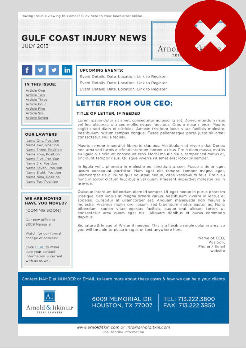
This means a few law firm standards are going by the wayside. First on the chopping block? The ever-popular sidebar menu showcasing the attorneys and/ or the firm. Three to five years ago, every law firm email newsletter consisted of either a left or right side bar containing lawyer photos, contact information, social media links, or links to different practice areas on the website.
While this design looks great on a desktop, it’s a nightmare for mobile devices and tablets. Because of the narrow width of a smartphone, the device essentially stacks all of the elements contained in the template. This means the main content displays at the beginning of the email on a mobile device, and all of that side bar information is pushed to the very bottom. Or in even worse case scenarios, 1) the template is coded incorrectly, forcing users to scroll through the extraneous sidebar items at the top of the email before arriving at the substantive content or 2) the template isn’t mobile responsive at all.
Another outdated legal industry email marketing default: content, content, and more content. Content is king for website and search engine optimization… but minimalism in the name of the game when it comes to email marketing. Consider the average time spent reading an email is now 11.1 seconds; keeping copy crisp, getting to the point quickly, and enticing the reader are all crucial to getting your message across. Instead of being long and boring, email marketing content should instead encourage readers to take action, such as clicking through to your website, social media channels, or earned media on a third party website.
A FEW BEST PRACTICES FOR EMAIL DESIGNS
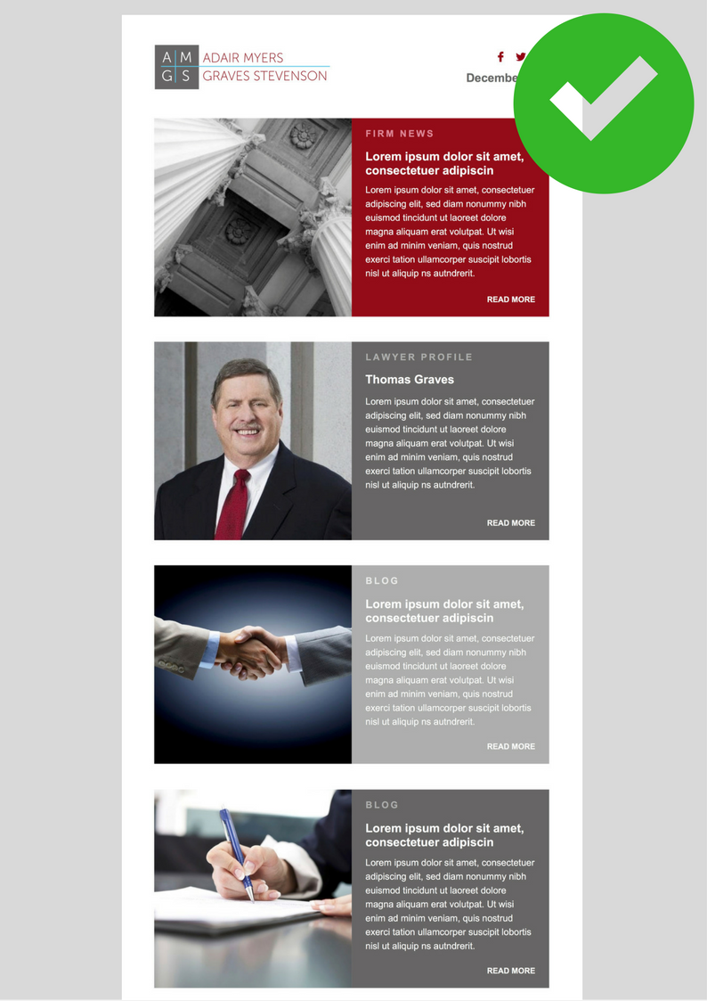
- Use a single column layout. This ensures your emails will smoothly transition from desktop to tablet to mobile without any structural display issues. Most templates are designed for a standard 600-pixel width for desktops and 320-pixel width for mobile devices. Don’t deviate too far from these parameters when designing.
- Stick with system fonts (or web safe fonts) for maximum readability. These are the standard fonts that are pre-loaded into all operating systems. If your template uses a non-system font, then the mobile device or desktop will convert the text to a font it knows. This can wreak havoc on spacing, layout, and design.
- Make sure to use the preview function. Most email marketing platforms allow you to specify the line of text appearing below your subject line in the recipient’s inbox. This is a great opportunity to entice readers to open your email, and should be limited to no more than 75 or 100 characters.
Emails can be an incredibly powerful marketing medium. Find out how we can help you transform your emails into sleek and effective communication tools.


Leave a Comment