Last year was a big year in terms of development updates and changes for websites, especially with the launch of Google’s new Accelerated Mobile Pages platform and Facebook’s Instant Articles. Mobile traffic continued to climb, as did mobile advertising – with predictions that by 2019, mobile advertising will represent 72% of all US digital ad spending.
With all of the discussion surrounding development updates, search engine algorithm shifts, and the onslaught of mobile everything, what does this mean for website design? Below are some major website design trends we’re expecting to see in 2017… including a few holdovers from previous years.
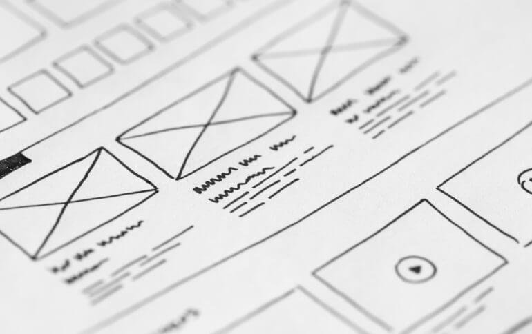
SIMPLICITY
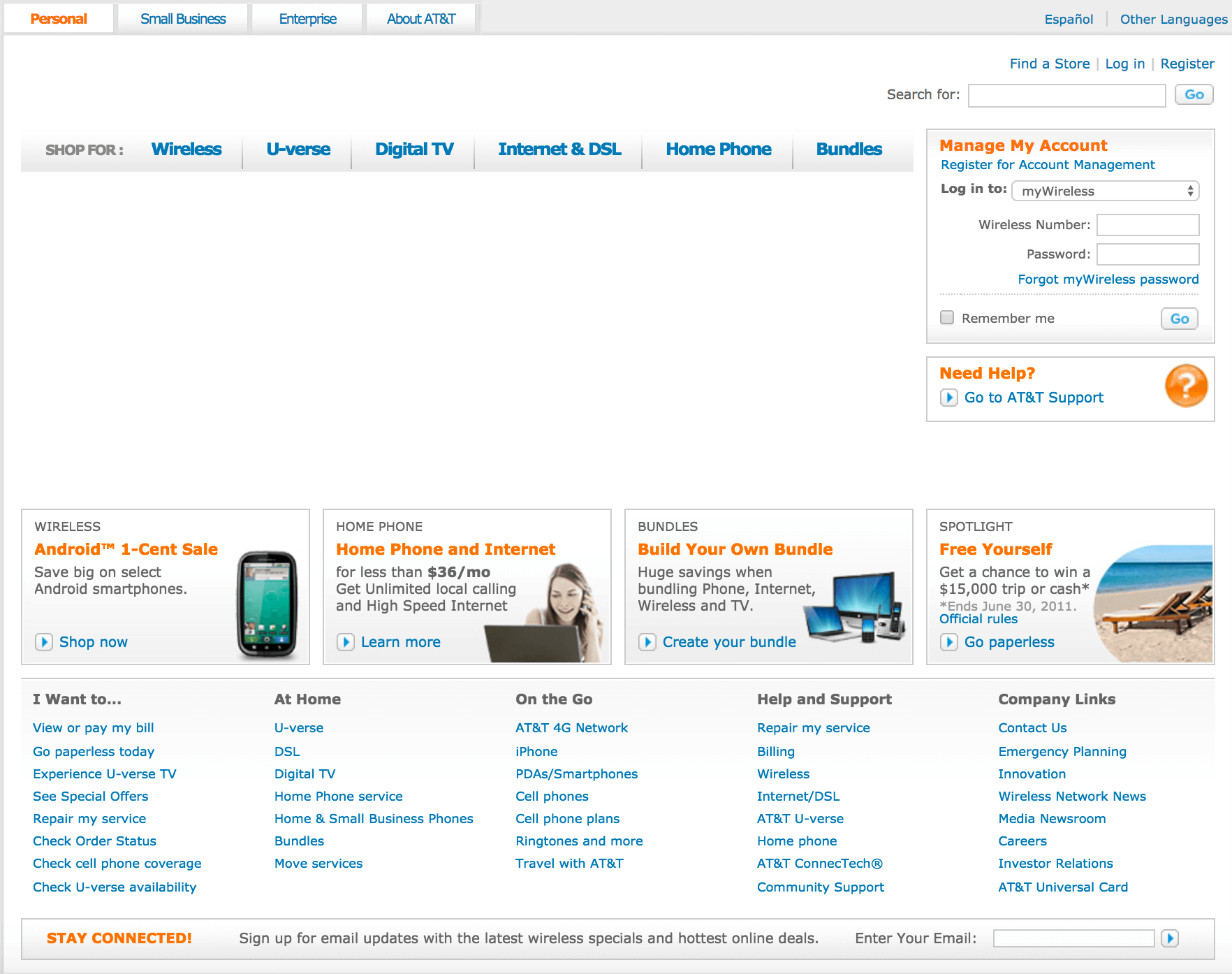
The first few generations of website design were constrained by dial-up modems and slower Internet speeds. As the Internet became faster and more accessible, designs became more complex and laden with bells and whistles. Take for example AT&T’s homepage from 2011: multiple menu bars, a row of buckets, a right sidebar login menu, and dozens of footer links comprised the homepage. The site was incredibly text-heavy and provided little visual stimulation for the viewer.
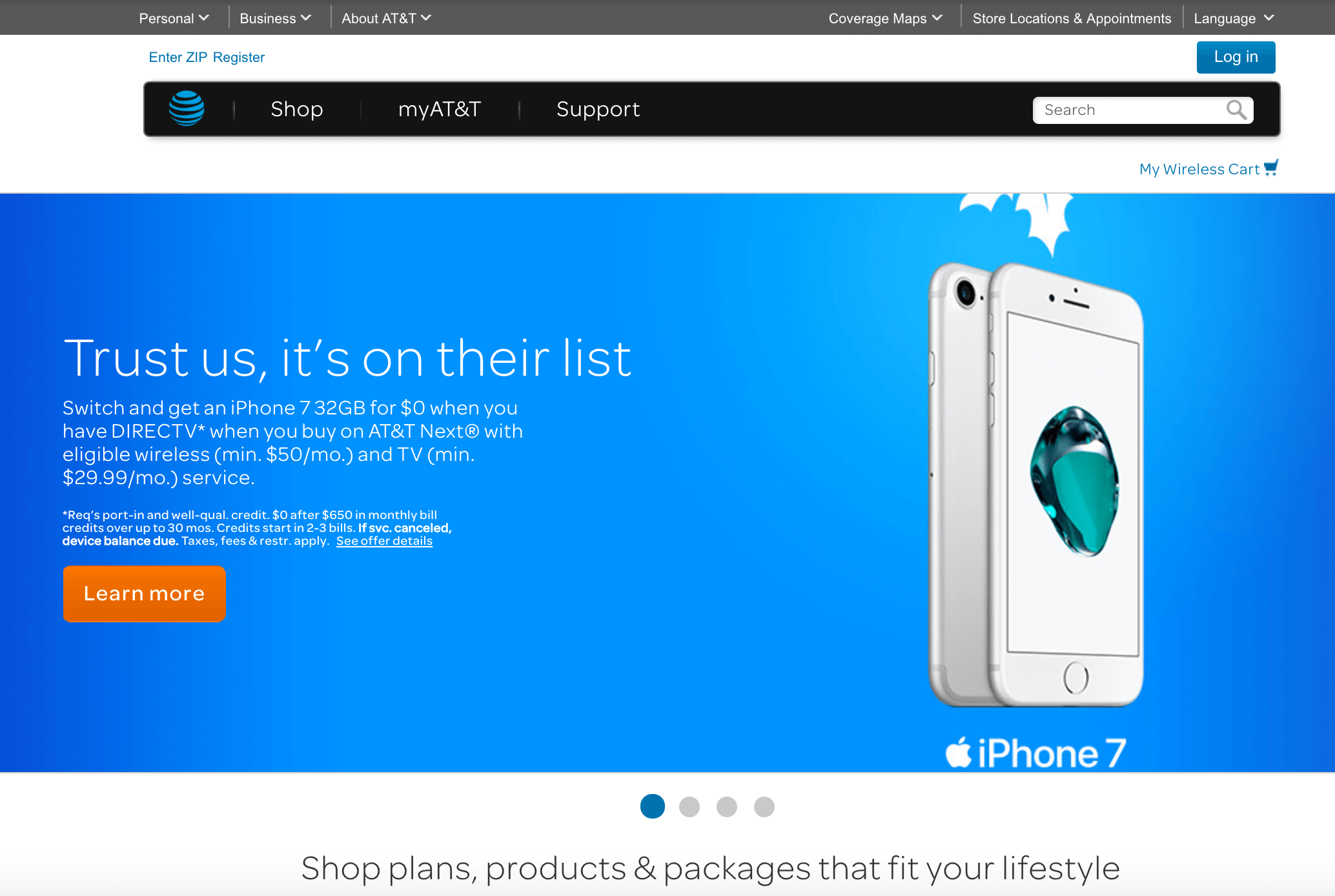
Compare that homepage to today’s version, which is much cleaner and designed with a focus on imagery. The login is reduced to a button, and while multiple menu bars still exist, they each contain only three options. The above-the-fold section of the homepage contains one large rotating image, and each of those images utilizes extensive white space and oversized text.
Website design is moving away from the previously popular text-heavy homepage styles, and instead focuses on images populated with only a few words of prominent text. While creating a more visually engaging landing point for your visitors means ditching some of the text in the header, as design moves towards more vertical style homepage layouts there is still plenty of room for the ever important SEO text as you scroll down the page.
SCROLLING
Because of the popularity of mobile devices and tablets for web browsing, more websites are utilizing a long scrolling homepage design. Scrolling has become an instinctive reaction for website browsing, and vertical layouts aren’t just a design trend: they are crucial for usability. Scrolling allows designers to guide visitors from section to section, leading them toward a goal while also spreading out content. This provides opportunities for buttons and contact forms to appear more prominently, drawing attention to “calls-to-action” or CTAs.
It’s not only faster to scroll than to click: it’s also easier, meaning users will consume more content by scrolling than by clicking. Websites still need the structure of multiple web pages, especially for gauging traffic flow through analytics. But vertical design creates an engaging user experience that translates well across multiple platforms for responsive design.
PARALLAX
Hand in hand with vertical design and scrolling are parallax effects. Simply put, parallax is an effect where the background content or image moves at a different speed than the foreground content while scrolling. This gives the website an animated look and engages users visually in a manner static images can’t. This website showcases multiple variations of parallax effects. As this trend continues to grow, expect to see more – and fancier – parallax effects.
BIG BOLD TYPE
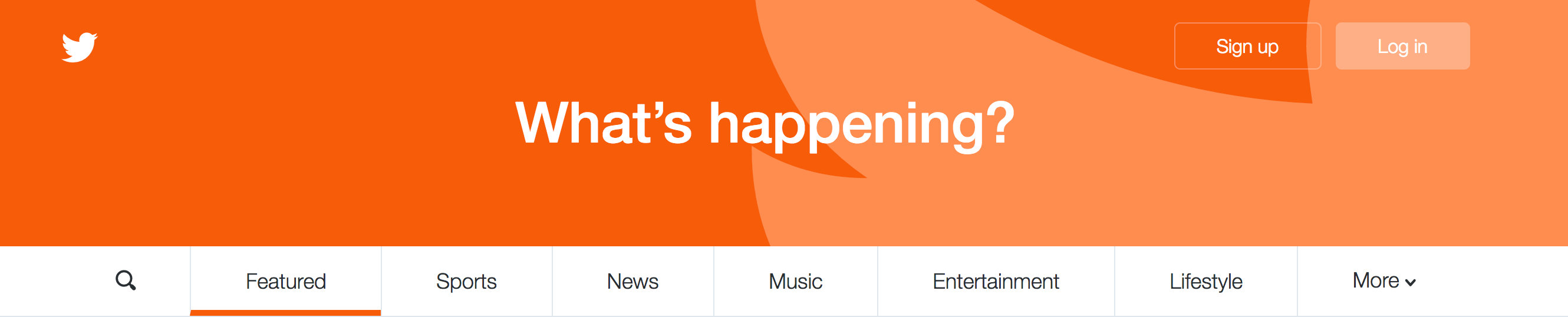
With simplicity reigning supreme in design, the door is wide open for more interesting font choices, custom font designs, and creative font use. Calling attention to one main tagline or point instantly grabs a visitor’s attention and communicates the purpose of the website. Twitter provides a great example on its homepage, where the main header image consists solely of its logo and big bold text asking the visitor, “What’s happening?”
Taking typography risks can have huge payoffs, but keep in mind cool lettering still needs to be readable. If the visitor struggles to read or understand your message, the design may look cool but ultimately fails its core objective.
MUTED, NATURAL COLORS
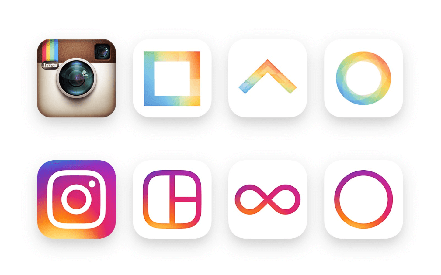
The past several years, neon and bright colors dominated website design. Bright oranges, hot pinks, and vivid blues permeated the scene – just take a look at Instagram’s rebranding effort as an example. While 2017 will still have bright colors in play, they will fade into the realm of accent colors through the use of gradients.
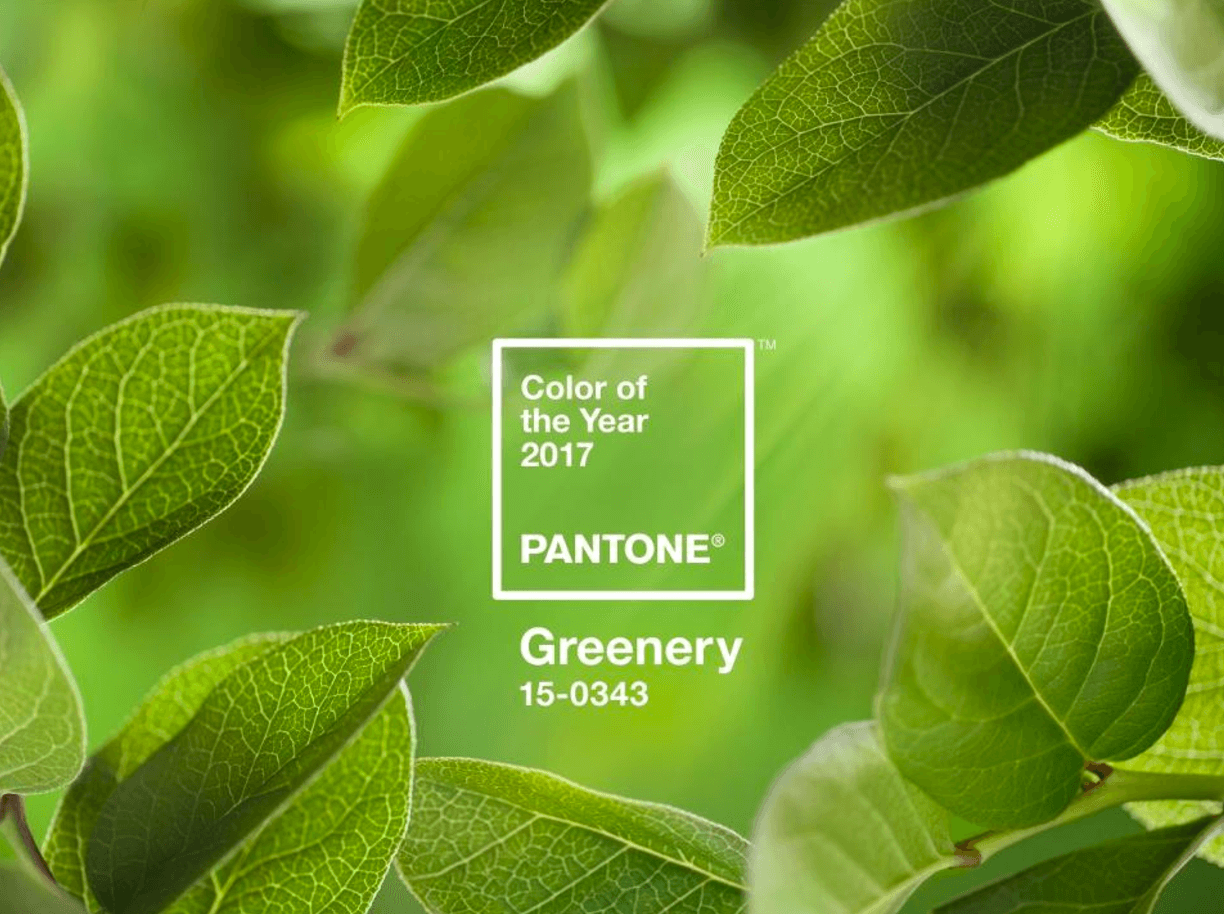
Most notably, however, will be the rise of more earthy and ‘natural’ colors for design. Take for example Pantone’s Color of Year for 2017, aptly titled Greenery. “There’s a growing desire to reconnect with Nature and what is real, and find ways to disconnect from technology. We need a break. We need to stop and breathe,” Laurie Pressman, the Pantone Color Institute’s vice president, told to FORBES. “(Greenery) is about unity and community—connecting to oneself and others and a higher purpose, Nature.”
Look for website design to incorporate this motif of returning to nature and finding ways to connect technology to environment through the use of muted tones.
NOT SURE WHERE TO GO FROM HERE?
Keeping up with the latest in design and development can be daunting, especially while trying to run a law practice. That’s where we come in: from custom designed websites and up-to-date digital marketing practices, we’ll make sure your website is both visually stunning and digitally optimized to provide the best ROI. Contact us today for a consultation about your website.


Leave a Comment