 Your law firm’s logo is one of the most important aspects of its brand identity. A logo is the foundation of the firm’s entire design aesthetic, signaling to consumers subliminal messages right off the bat. Is your logo traditional with a serif font – potentially indicating a more conservative or even older law firm? Or is it more modern with a sleek sans serif font and bright colors – indicating perhaps a technologically advanced firm? Regardless of what you choose, one of the main components of any logo and/or brand identity is color.
While color may seem like a simple and easy element, it’s actually quite complicated – especially when it comes to printing. All too often, a law firm’s digital assets look significantly different from their printed materials in terms of color, which means their brand identity is compromised or diluted. In order to avoid this, understanding how color changes from digital to print is imperative.
Why Colors Look Different in Print
All colors are created by blending together different base colors. Remember the days of mixing paints in grade school? Adding blue and yellow together to create green? That basic principle still exists for both digital and print colors. The difference is how it is done for each.
Digital Colors are Created Using RGB
Digital colors are those you seen on a computer screen, mobile device, television, etc. These would be utilized on your law firm website, social media channels, and even email signatures. These colors are created by mixing Red, Green, and Blue colors, and are therefore referred to as RGB. When you mix these together, they grow brighter and increase in intensity. Metallics and fluorescents look fantastic on digital screens for this reason.
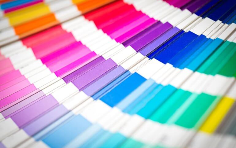
Print Colors are Crated Using CMYK
Printed items, on the other hand, are created by blending together four colors: Cyan, Magenta, Yellow, and Black or CMYK. You may have seen these initials if you’ve ever changed out the cartridges in an office printer. Each of the four colors is represented as a percentage, indicating how much of that color is added when printing. In the example below, you can the light purple from our own logo is comprised of 25.69% Cyan and 26.41% Magenta. There is no Yellow or Black at all.

When you mix these four colors together, they tend to become darker. Colors that may appear bright and vibrant on a digital screen can therefore appear dingy or dirty when printed – particularly warm colors, like yellows, oranges, and reds. Likewise, metallics and fluorescents are incredibly difficult to reproduce in printed materials.
Other Factors Impacting Color
Colors can also appear differently depending on two crucial factors: the type of paper you are printing on (referred to as “stock” by most printing companies) and the manner in which your items are getting printed.
Types of Stock
The type of paper you print on can have a huge influence on how your brand identity colors render, as well. Surprising though it may be, there are a lot of different shades of white paper. Printing on bright white stock will render colors more vibrantly than duller white or cream paper. Coated paper has a shinier, glossier effect – often creating images that appear crisper than those on uncoated paper. Colors can darken on uncoated paper, as the ink tends to absorb deeper in the paper and create a softening filter.
Types of Printing
You can also print materials for your law firm in two different manners: offset printing or digital printing. Offset printing is the traditional form of printing, utilizing plates and rollers, but can be very expensive for printing small quantities. Digital printing is when a digital image is transferred directly to the paper. This is a much more economical option for small print quantities that still maintains color integrity.
Only Foolproof Method? Pantone Colors and Spot Printing
Pantone colors (often abbreviated to PMS for Pantone Matching System®) are the ultimate true identifier of colors for both digital and print. PMS colors allow for “the faithful selection, articulation and reproduction of consistent, accurate color anywhere in the world.”
PMS colors are readily available for use on digital platforms. Printing in PMS is also an option, although its perfection comes at a price, making it cost prohibitive for smaller law firms. In order to print in a specific PMS color, special Pantone brand ink is required. This type of printing is referred to as spot printing or spot color. It is only available through offset printing.
Looking to Update Your Law Firm’s Branding?
Whether you are starting a new law firm or looking to update an existing firm’s logo or visual identity, we’ve helped hundreds of law firms create brand standard guidelines. Find out how we can help your law firm today.


Leave a Comment